Qokit Design Guide
Public design contracts for platform integration, extension development, and component usage.
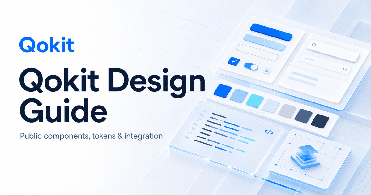

Qokit Design Guidelines
The Qokit Design Guidelines are intended for future platform integrators, extension developers, and frontend teams, publicly specifying the brand foundations, component interfaces, visual hierarchy, responsive requirements, and compatibility strategies that can be relied upon long-term.
This describes "what developers can rely on" and does not include internal product roadmaps, AI prompts, repository decision processes, or unreleased implementation details.
Quick Integration
import { Button, Card } from '@qokit/components/ui';
import { platformButtonSkin, platformCardSkin } from '@qokit/components/skins/platform';

export function IntegrationAction() {
  return (
    <Card layer="shell" skin={platformCardSkin}>
      <Button skin={platformButtonSkin} type="button" variant="primary">
        连接 Qokit
      </Button>
    </Card>
  );
}
When integrating, select capabilities in the following order:
- Select basic components like Button, Card, and Dialog from
@qokit/components/ui; - Select stable product combinations from
@qokit/components/patterns; - Use
@qokit/components/skins/platform,site, oradminto adapt to the target interface; - Use shared CSS Tokens; do not copy component base styles;
- Verify desktop, mobile, keyboard, and long-text states.
Guide Map
| What you need to know | Documentation |
|---|---|
| Brand colors, fonts, spacing, and Tokens | foundations.md |
| Responsive, keyboard, and accessibility | accessibility.md |
| Component import, Skeleton/Skin public contracts, and upgrade methods | component-integration.md |
| Button and IconButton | button-component-rules.md |
| Card, Shell, overlays, and materials | card-surface-materials.md |
| Public quality standards for generated sites | generated-site-quality.md |
| Contract changes and upgrade records | changelog.md |
Public Contracts
- Component structure, attributes, and accessible behaviors are maintained by shared components;
- Skin only changes class slots and CSS variables, not business behavior;
- Semantic Tokens maintain the same responsibility across light, dark, and generated site themes;
- Breaking changes must be recorded in the Changelog with migration instructions;
- In case of discrepancies between documentation and code, the published component API prevails, and the documentation is corrected in the same version.